
Desert Coffee (USA): Creative Story
Coffee branding often borrows its identity from origin: Mountains. Farms. Coffee cherries. Warm earthy palettes.
For Desert Coffee, I wanted to move away from that familiar language and focus on a single idea hidden in the name itself.
Desert.
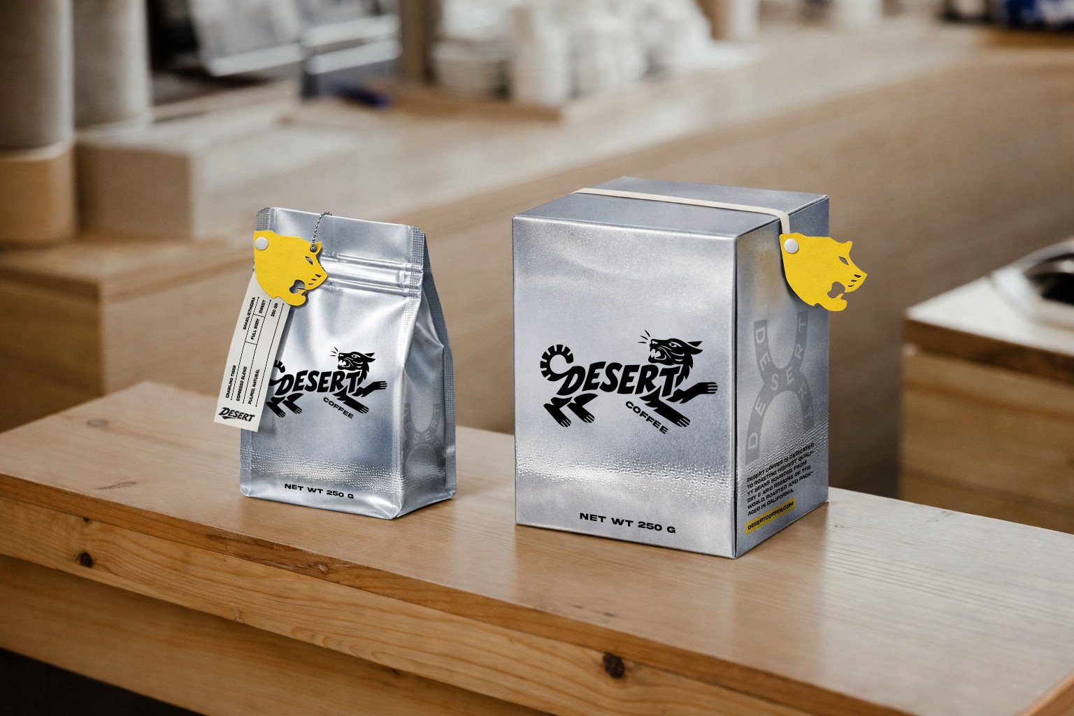
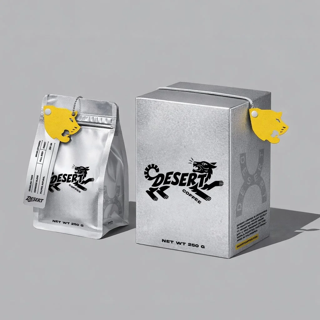
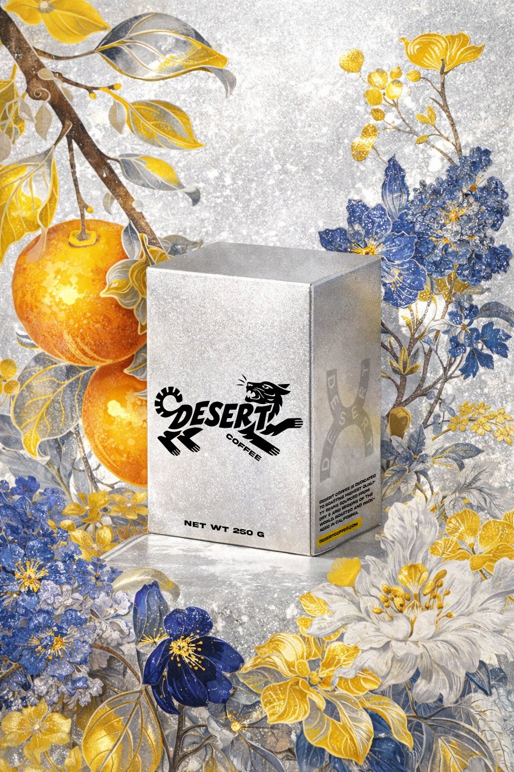
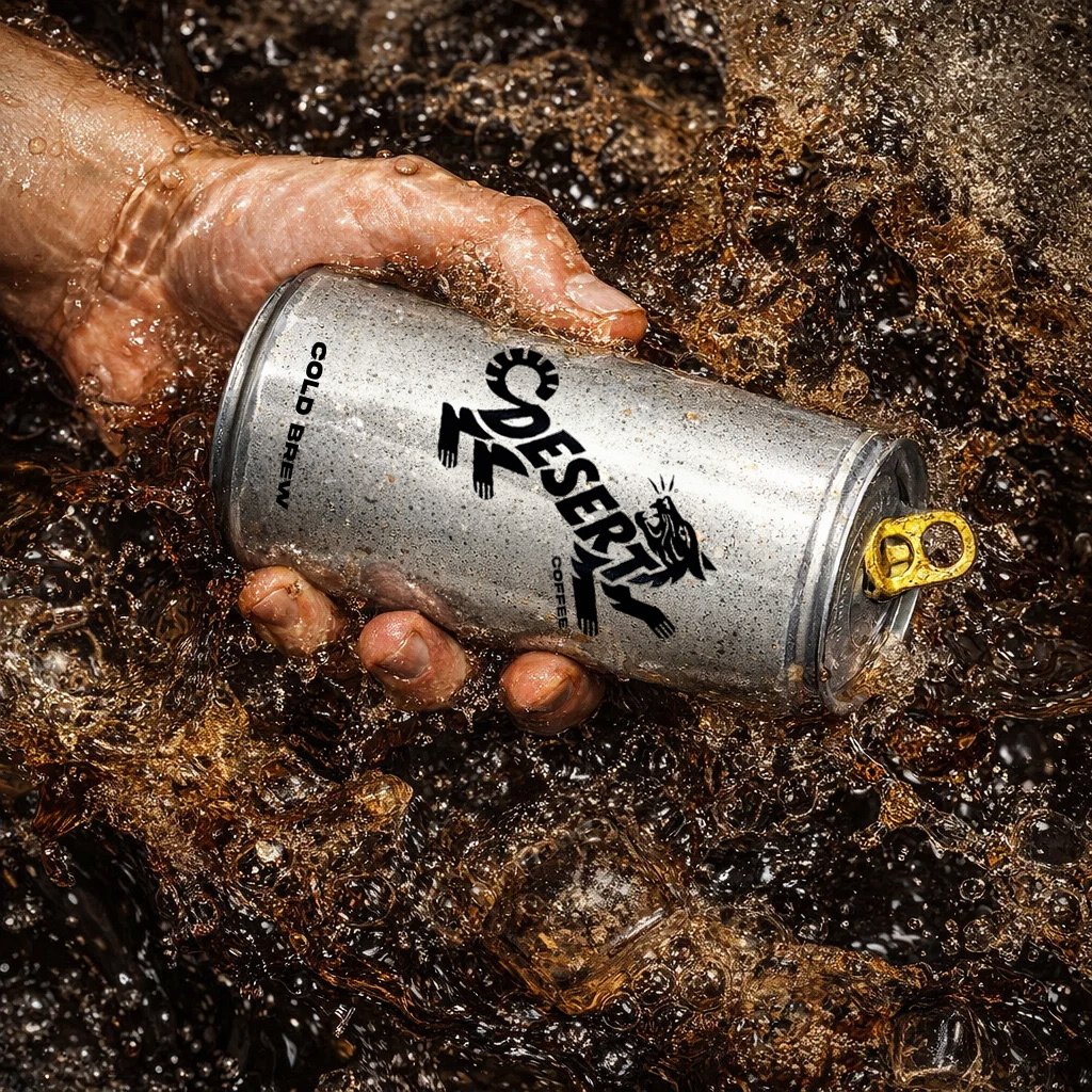
Rather than treating it as a place, I treated it as a visual atmosphere. The packaging became almost entirely reflective, using silver as a way to capture the intense light and shimmering heat of a desert landscape. Instead of covering the surface with graphics, I wanted the material itself to become part of the story - changing with its surroundings.
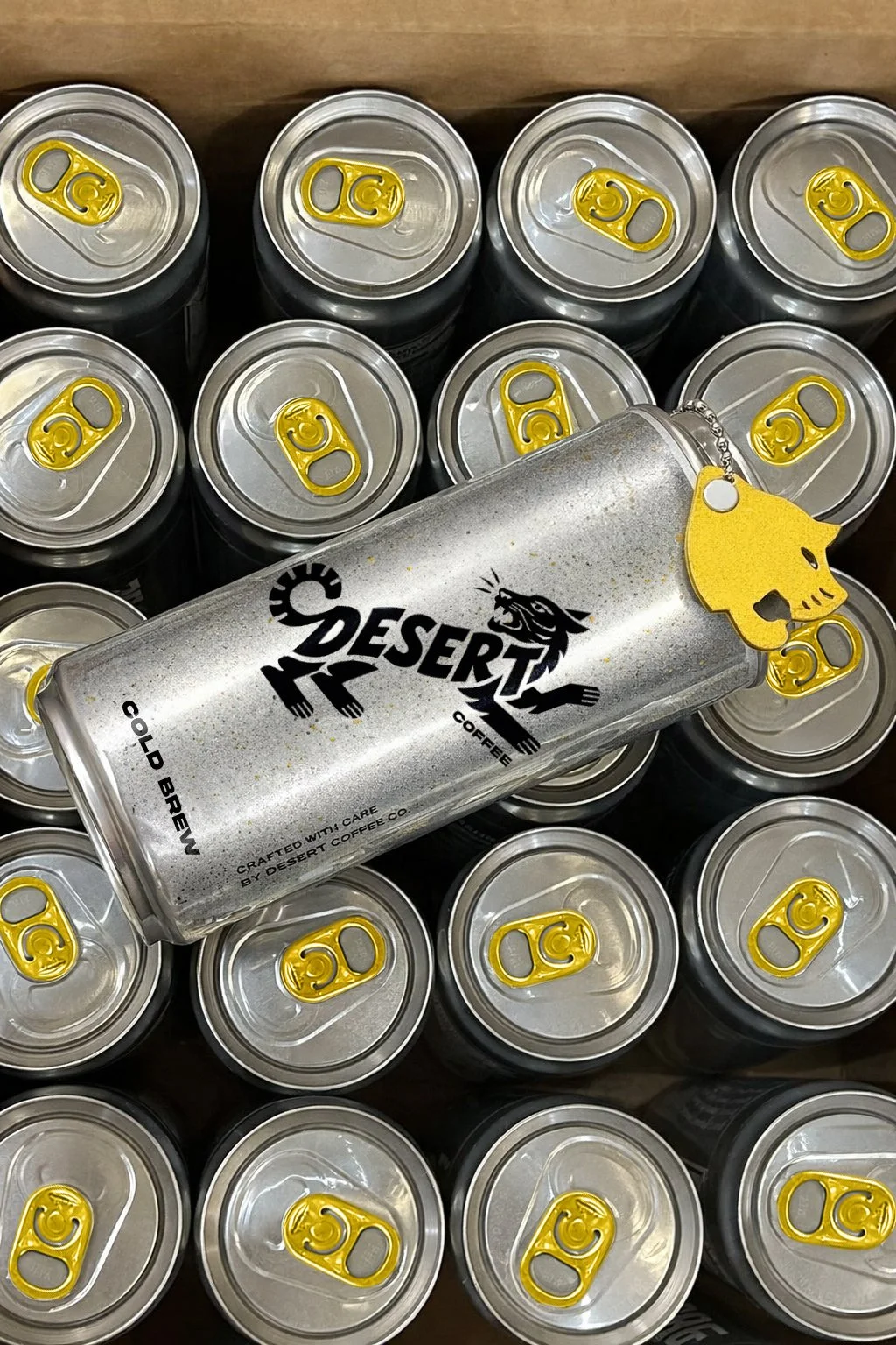
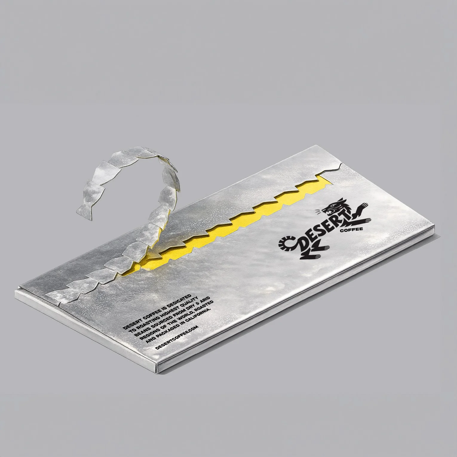
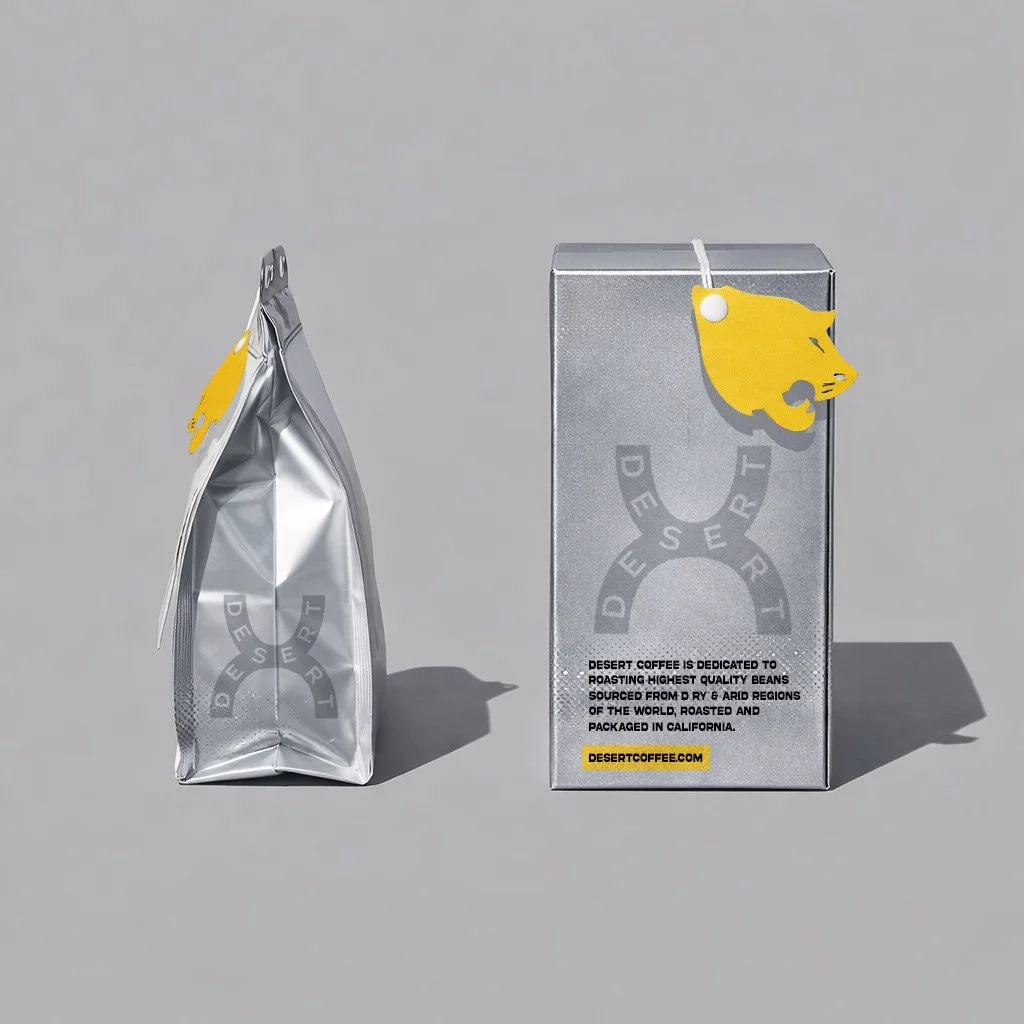
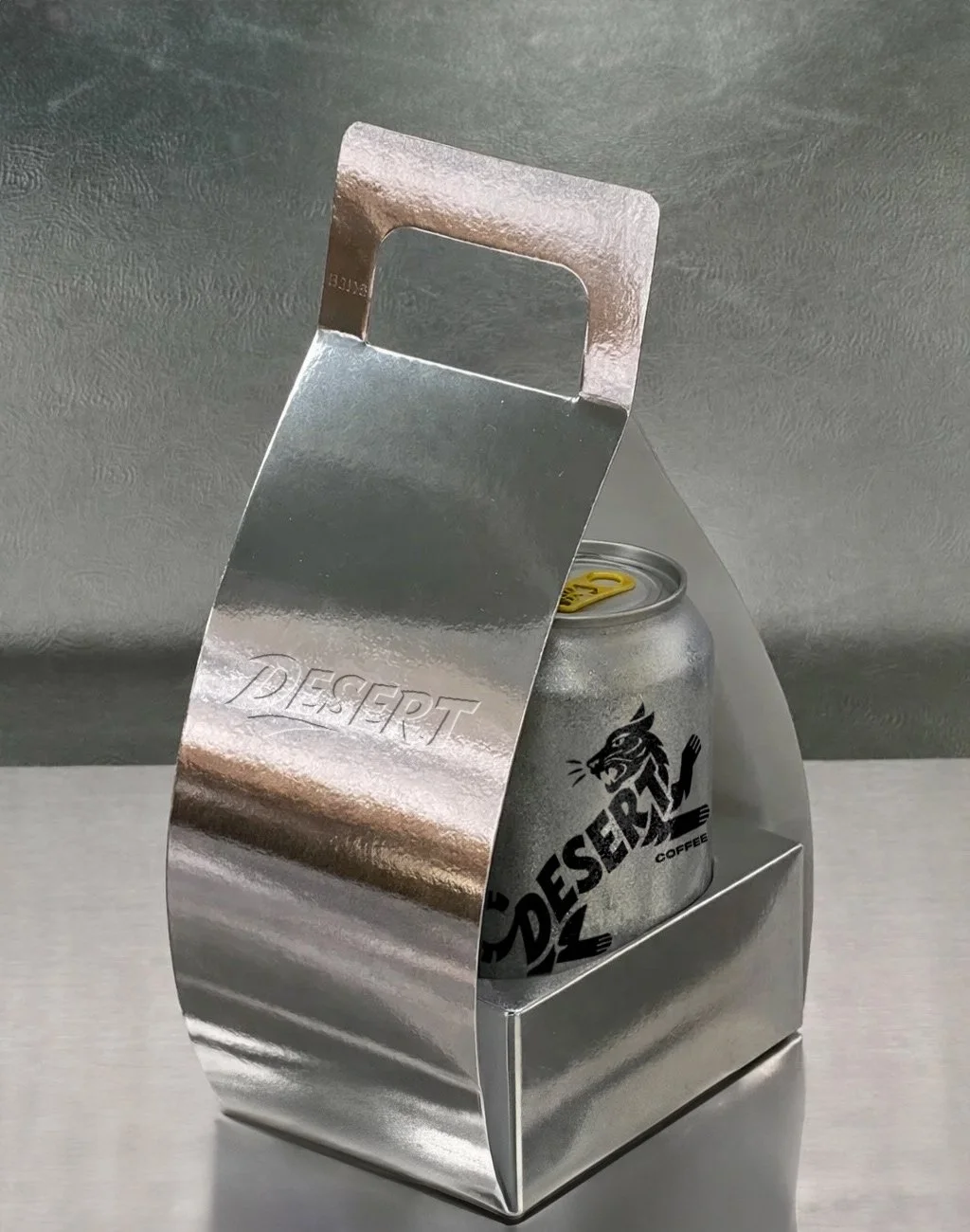
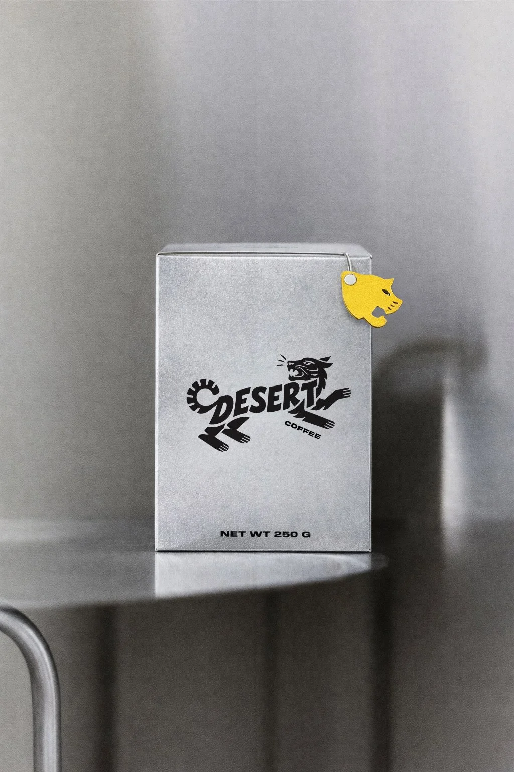
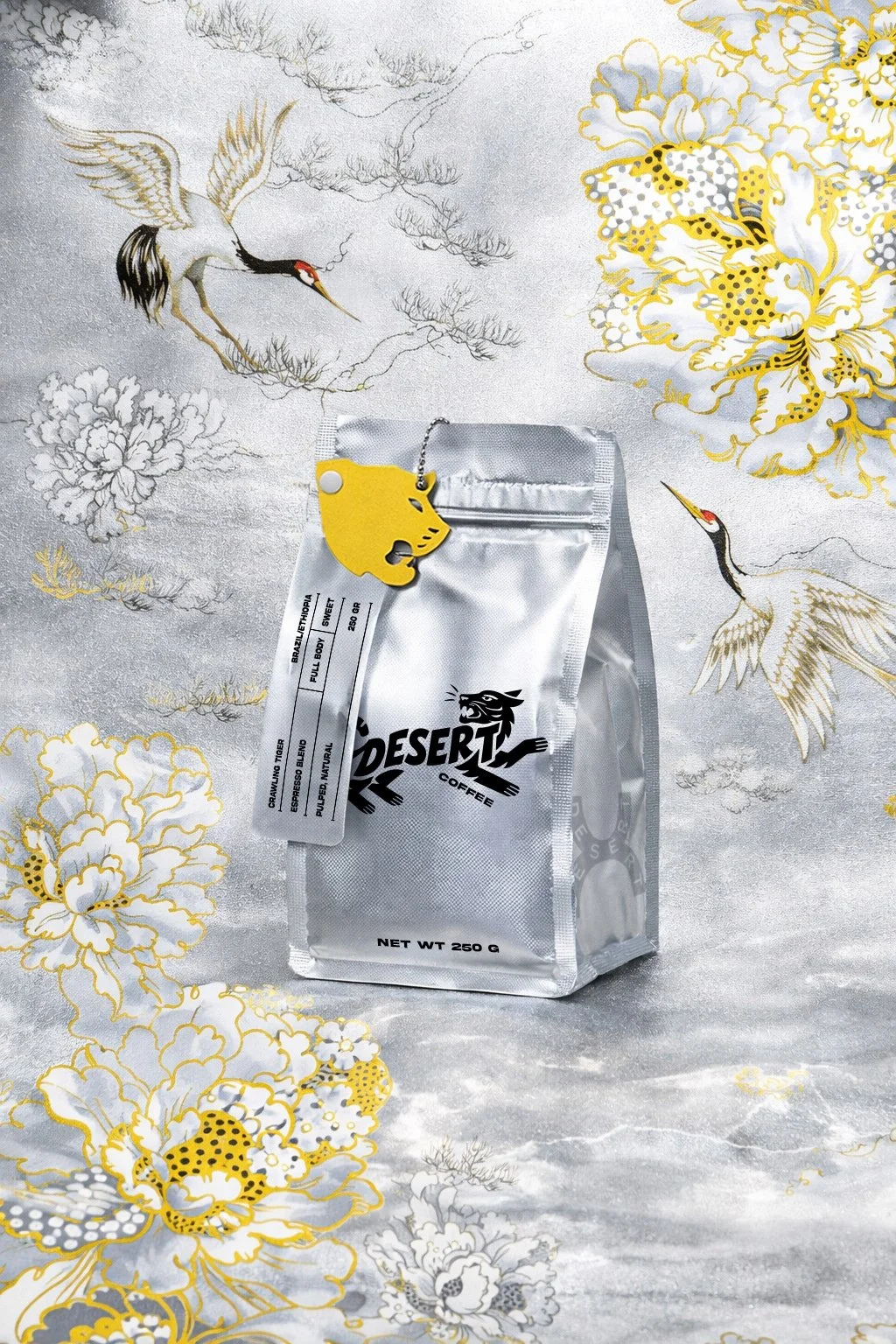
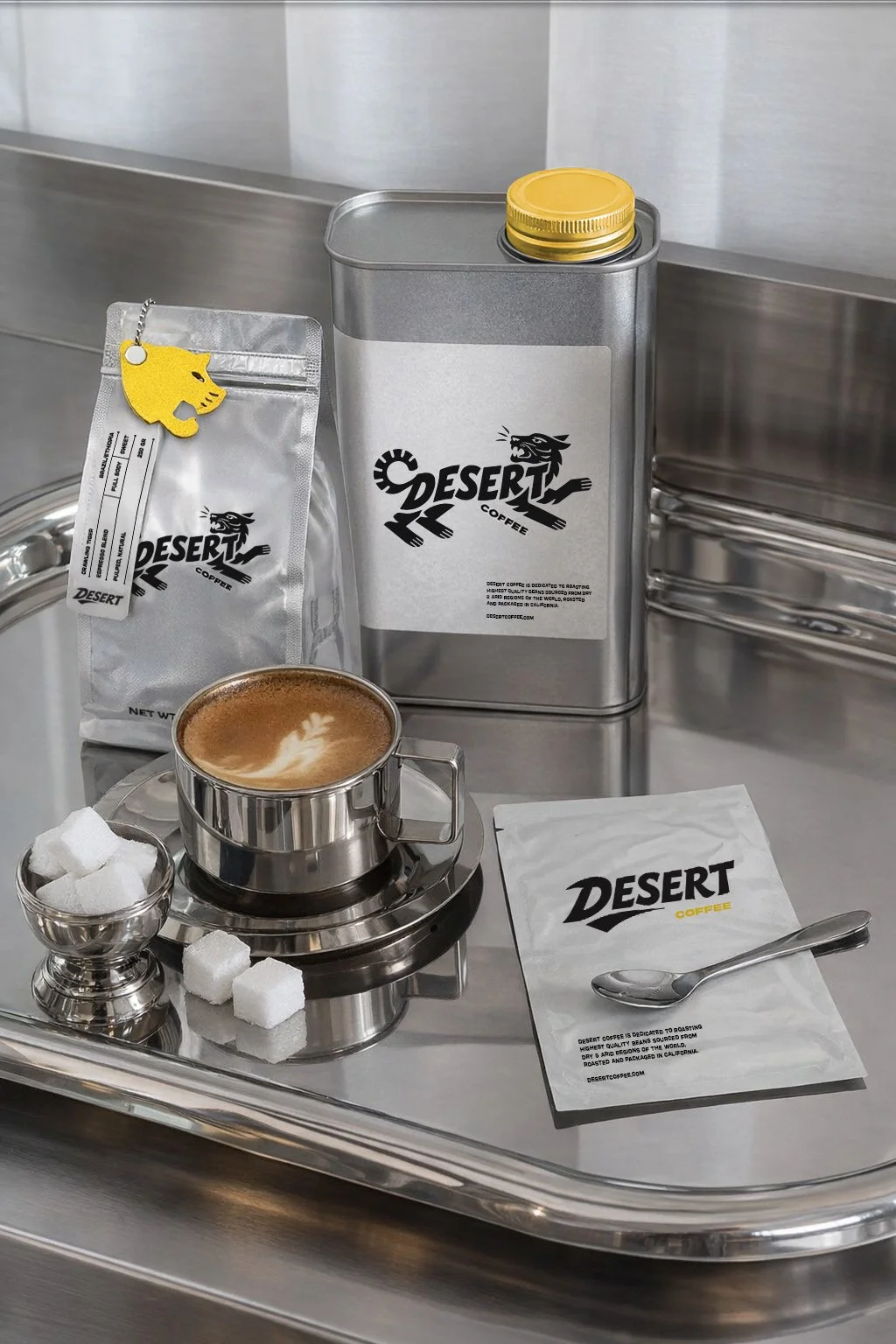
The only bold interruption is a vibrant yellow silhouette inspired by the profile of a desert predator. It isn't an illustration or a logo in the traditional sense. It's a simple graphic gesture that gives the brand its own unmistakable character while becoming an extension of the word Desert itself.
Sometimes a single visual idea can say more than an elaborate composition.
For me, Desert Coffee became an exploration of how simplicity, material and one memorable symbol can create a brand that feels both contemporary and instantly recognizable.
Recognition
The project received Behance Project of the Day and was featured by Instagram Design, introducing the work to a global creative audience. It later became one of my most widely shared coffee branding projects.
What kind of world would this character live in?