
Topia (UAE): Creative Story
Sometimes the right direction only appears after exploring all the obvious ones.
For Topia, we went through several visual concepts. They were well-crafted, familiar, and technically strong - but none of them felt memorable. They looked like coffee brands I had already seen.
That realization changed the project. Instead of asking what a coffee package should look like, I asked myself a different question:
What have I never seen on coffee before?
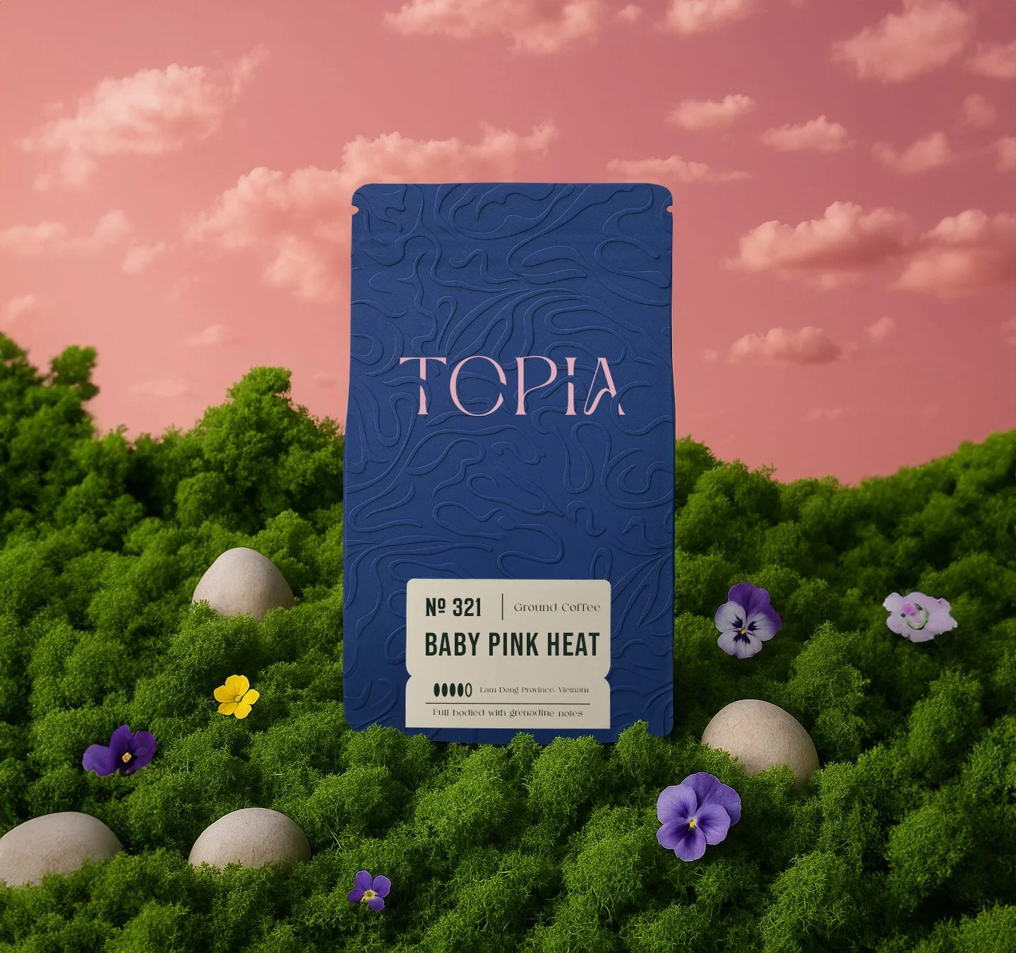
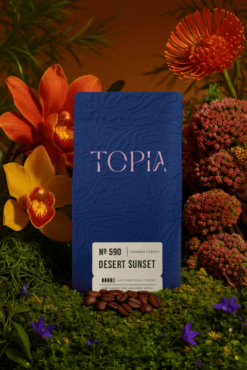
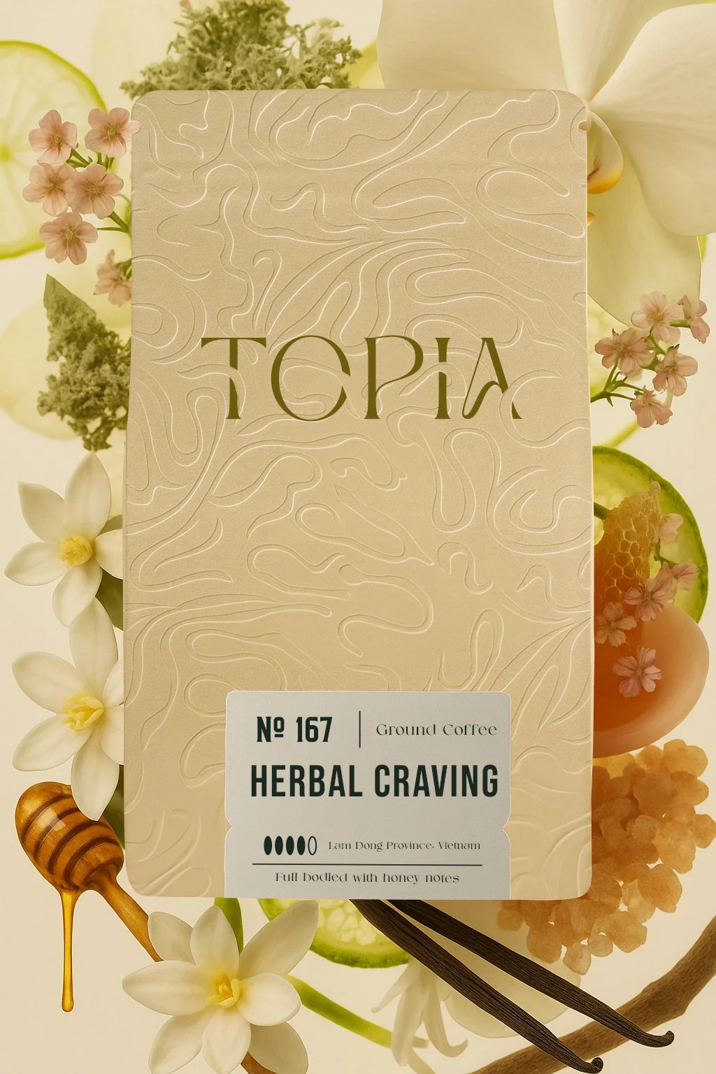
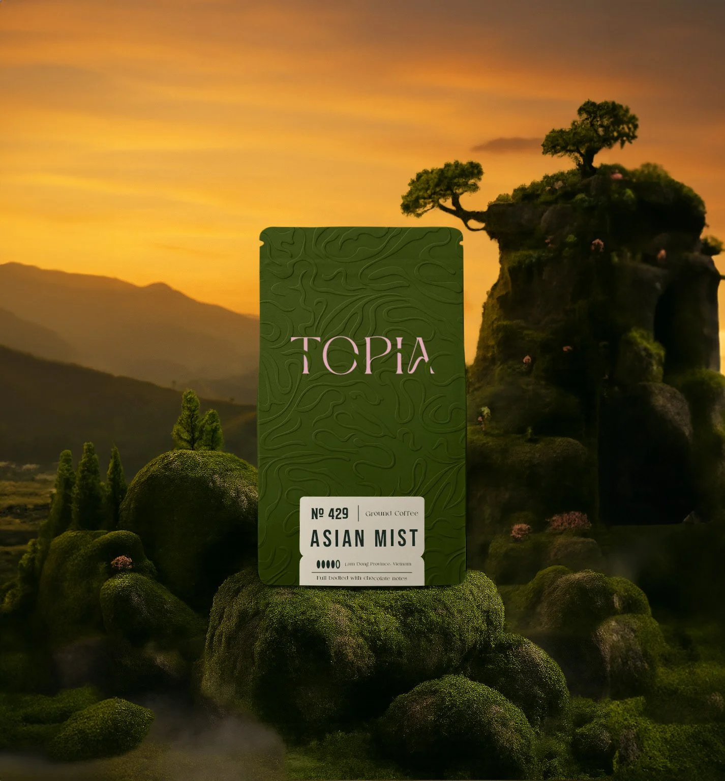
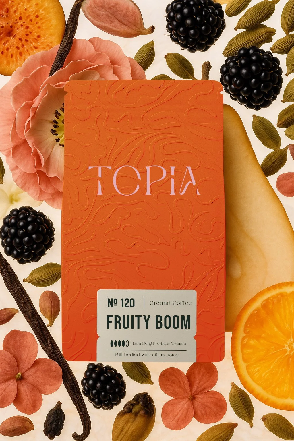
The answer wasn't another illustration or another color palette. It was texture.
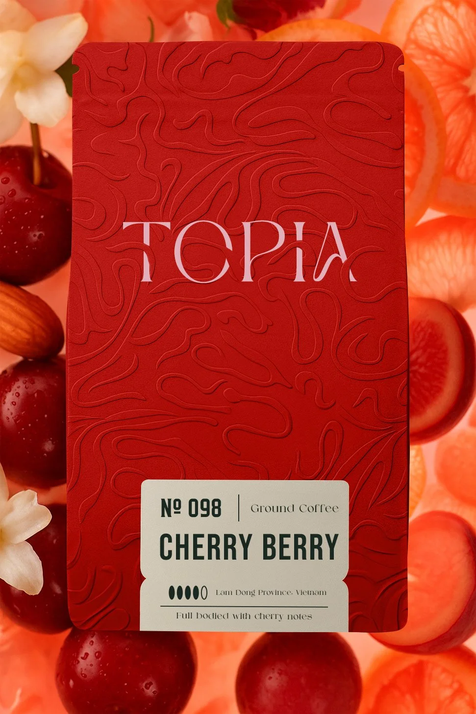
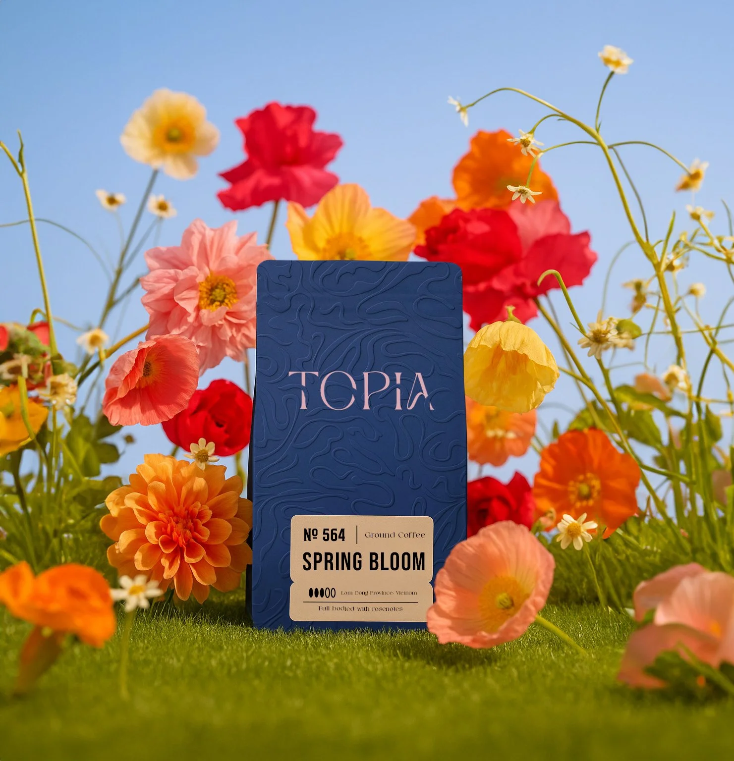
I became interested in creating a surface that people would want to look at before they even noticed the logo. A pattern that could feel organic without literally illustrating nature. Depending on how you look at it, it could resemble carved tribal markings, the delicate traces left across desert sand, or the rhythm of intertwining branches and wild vegetation.
Rather than competing for attention, the identity emerged from the pattern itself, allowing the entire package to feel like one continuous visual language instead of separate graphic elements.
Looking back, Topia reminds me that originality doesn't always come from adding more. Sometimes it begins by questioning the visual habits of an entire category.
Recognition
The project quickly became one of my most recognized coffee branding works, receiving widespread attention across the international design community and helping establish a distinct visual direction within my coffee portfolio.
What if wellness felt like belonging to a club?