
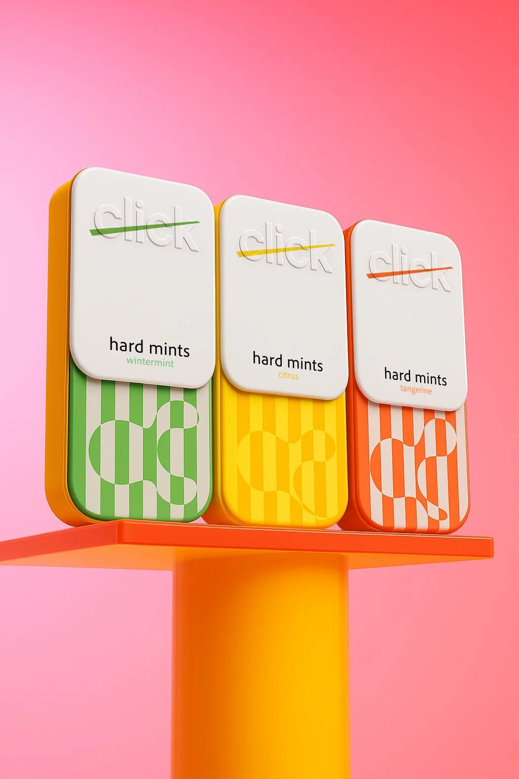
Click Hard Mints: Packaging Design & Brand Identity
The small gesture that became the brand
Some brands begin with a logo. Click began with a sound.
The project was created around a familiar everyday object: the pocket-sized mint tin. The challenge was to make something compact and functional feel distinctive enough to be recognized instantly - whether held in the hand, placed on a shelf or seen from a distance.
Opening the tin creates a small, satisfying click. That simple gesture became the foundation of the identity.
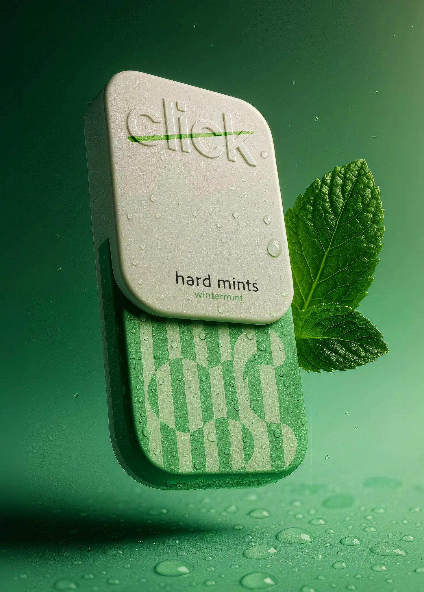
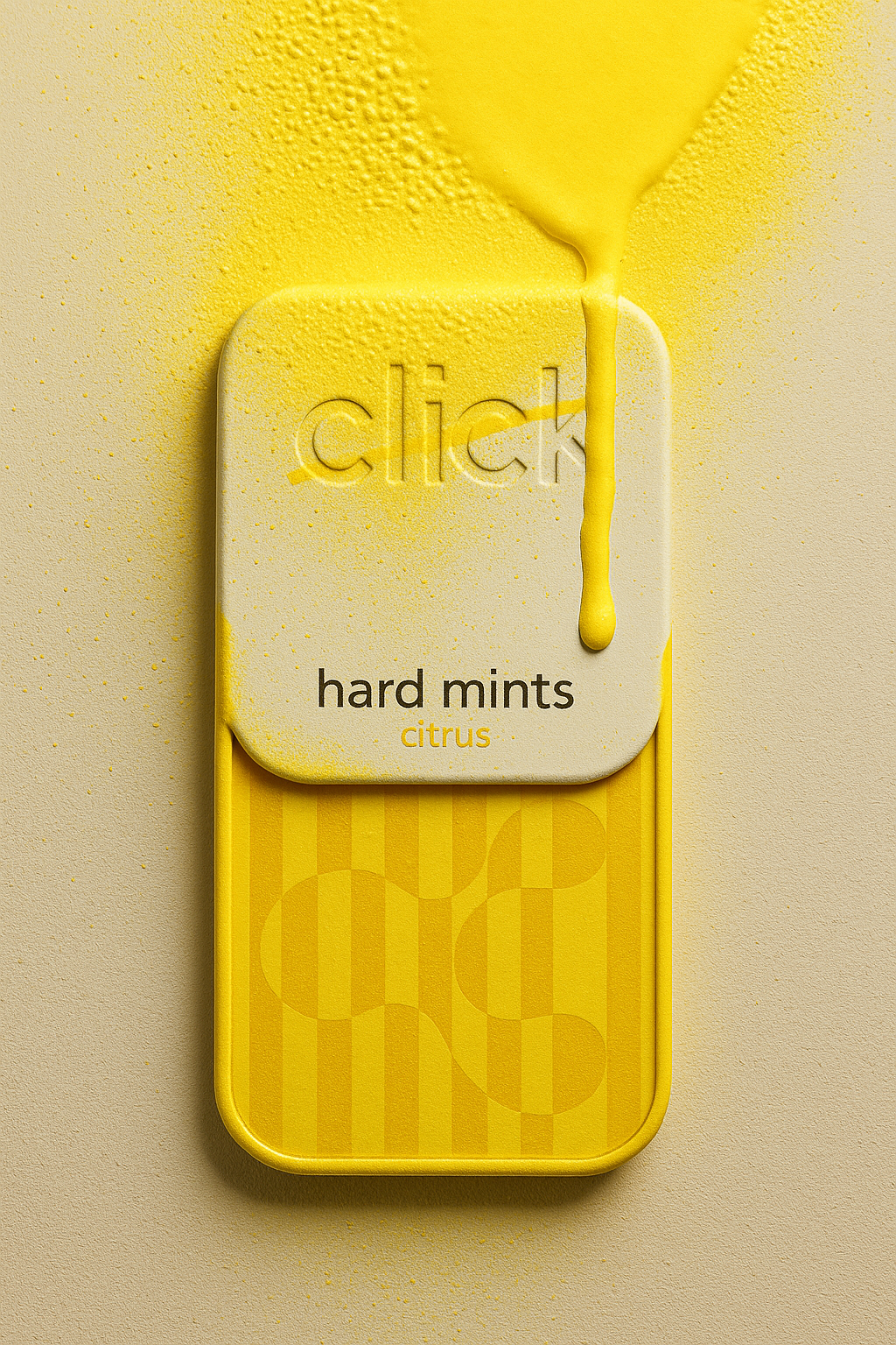
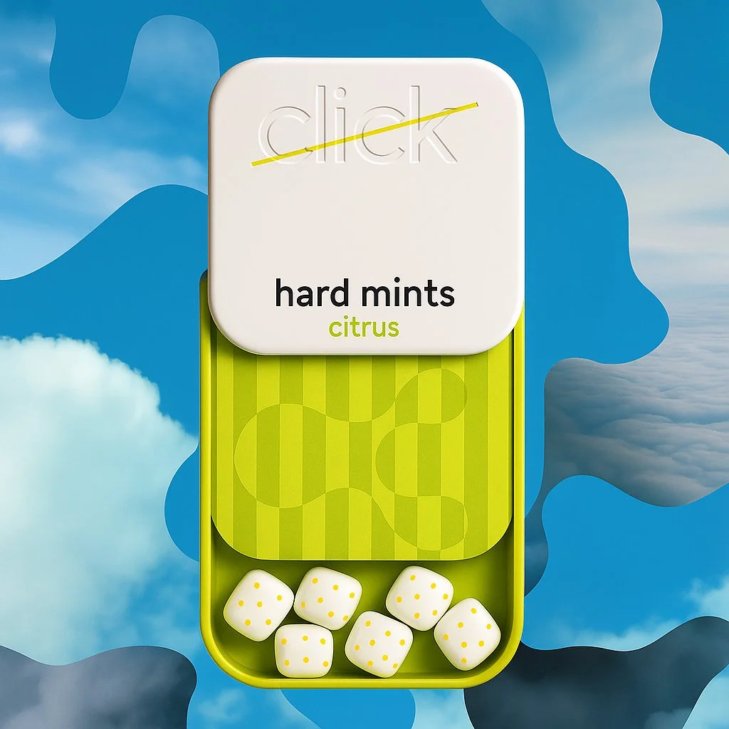
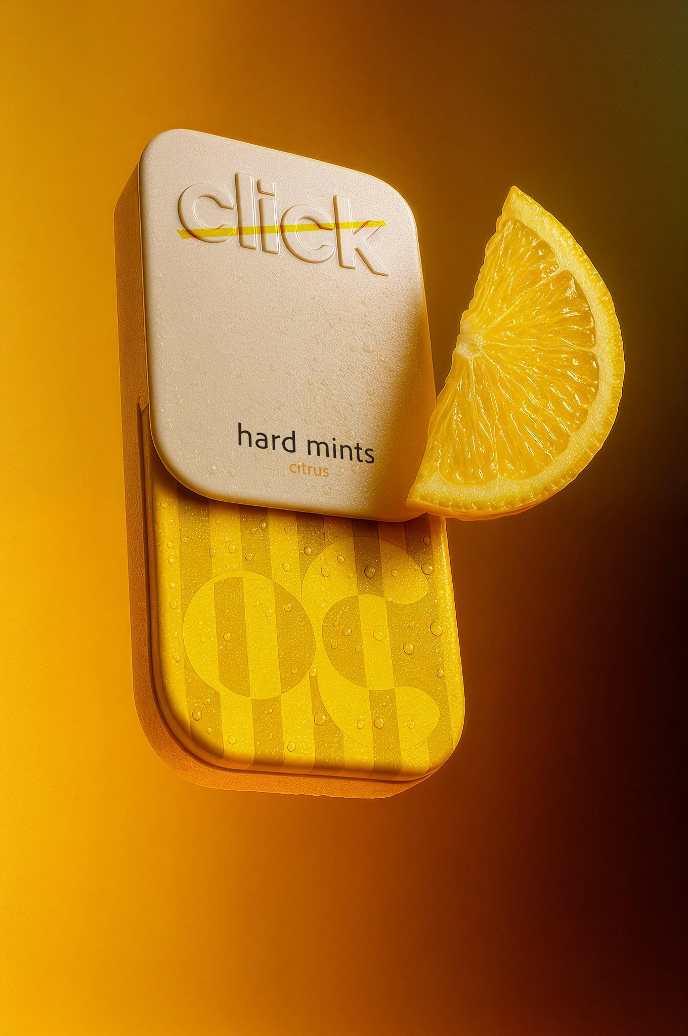
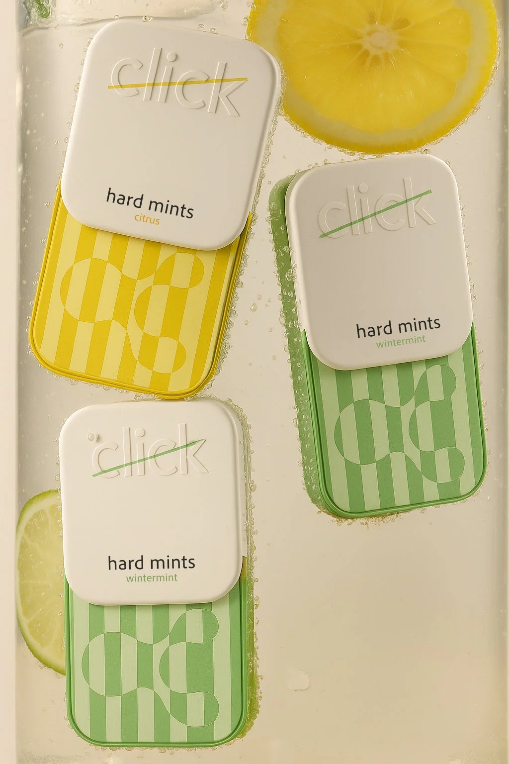
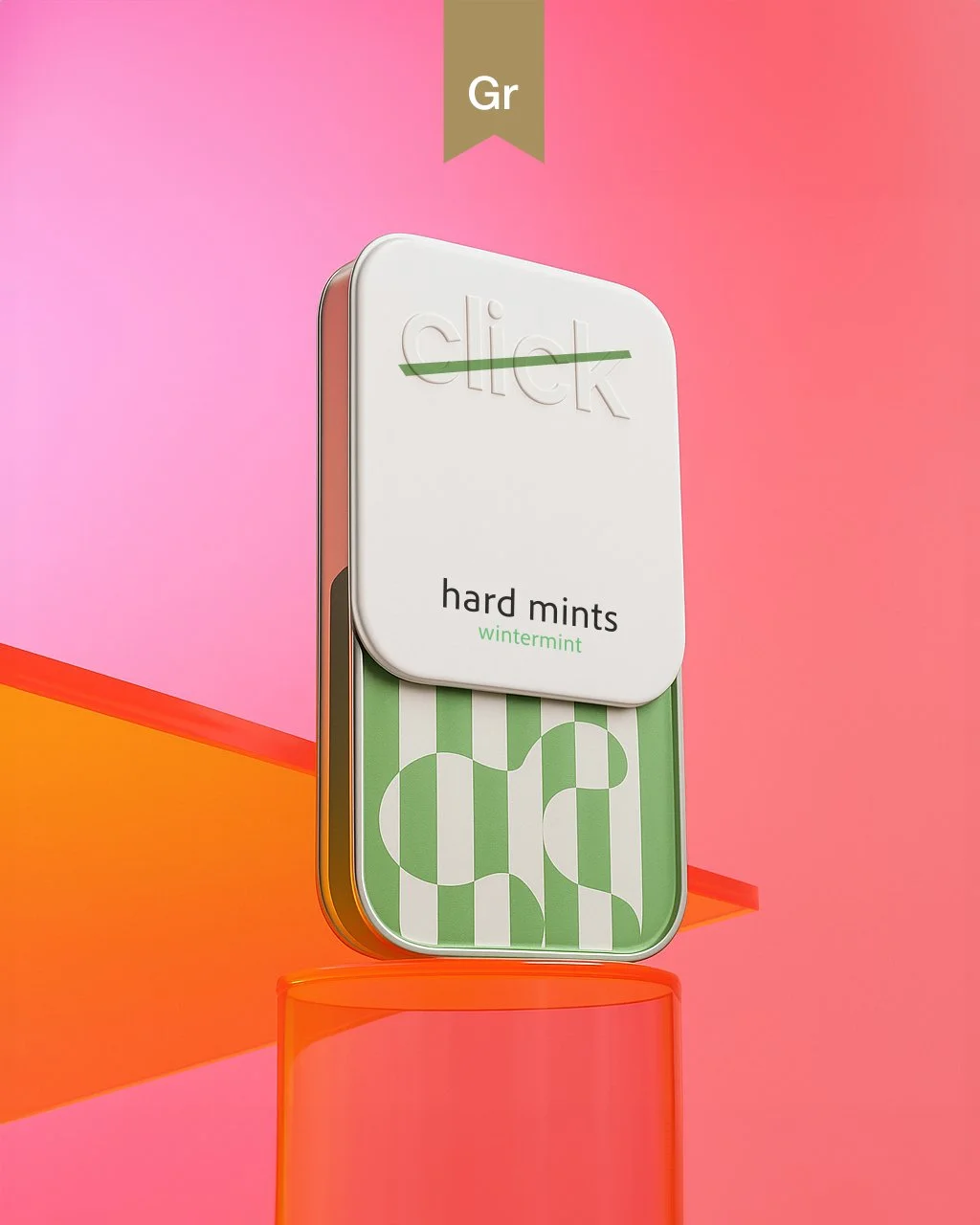
Designed around the click
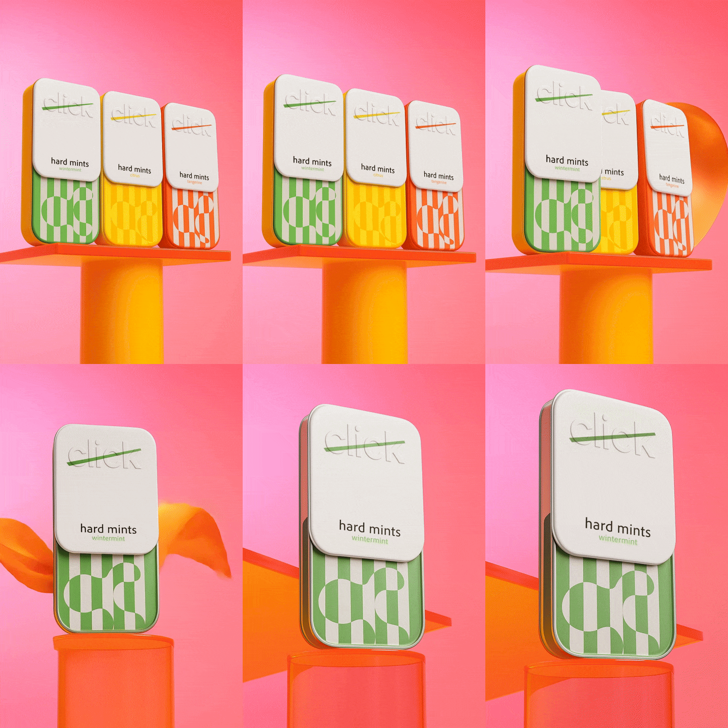
The rounded metal tin, embossed logo and diagonal line across the lid turn the package into the brand’s most memorable asset.
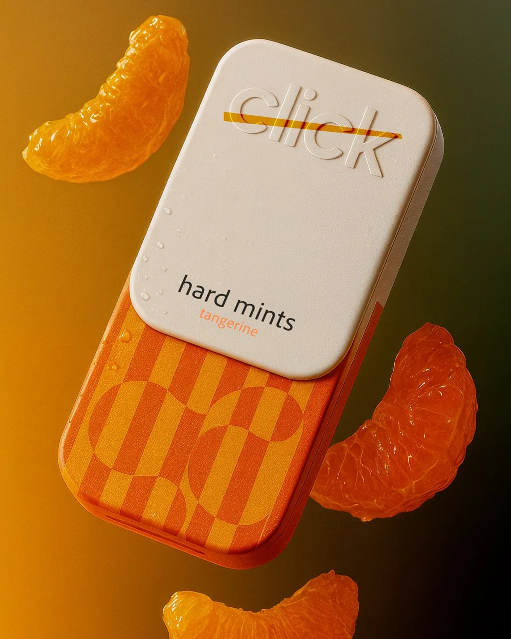
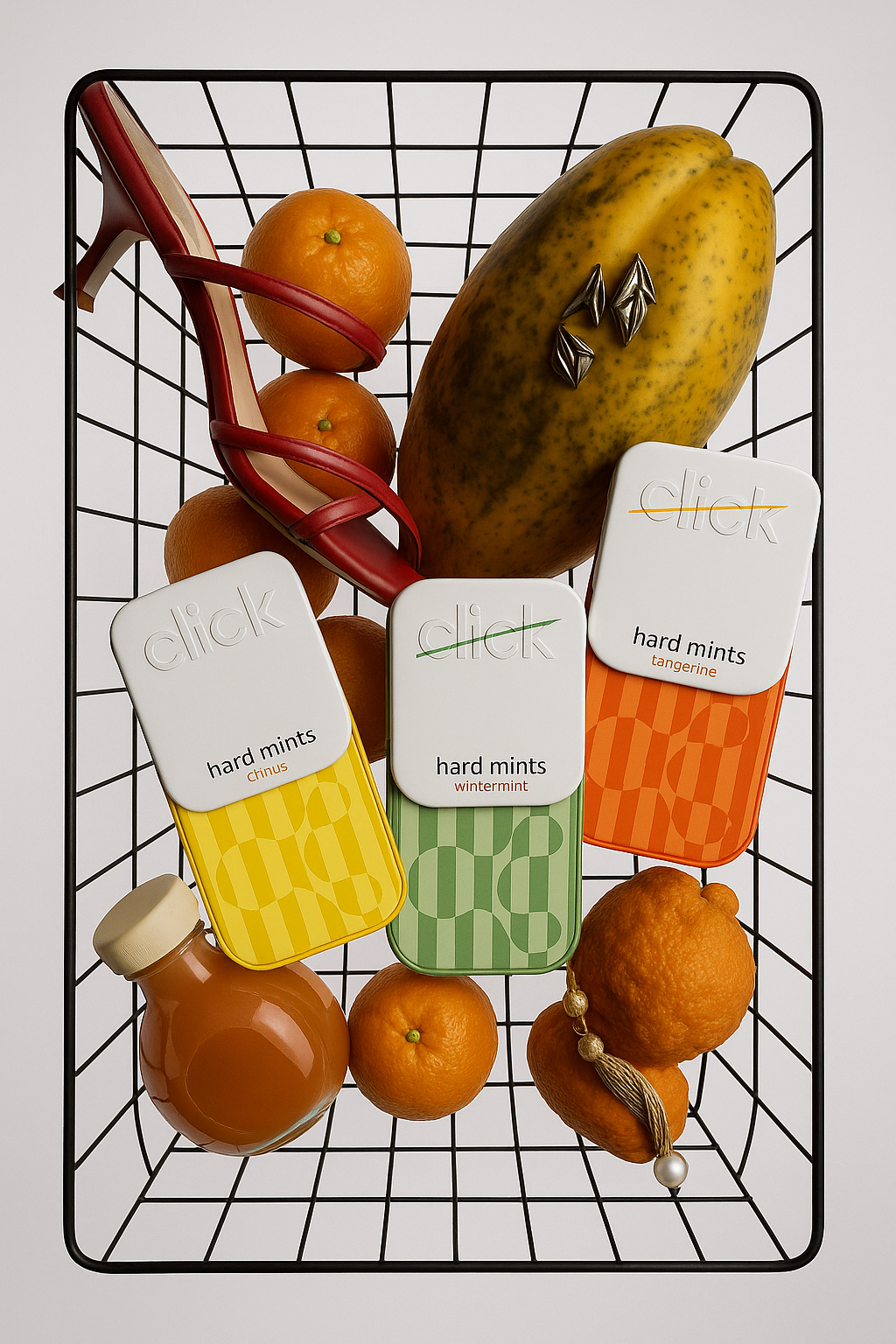
Rather than adding more information or decoration, the design relies on structure, color and tactile detail. The white upper section creates consistency across the product family, while geometric patterns and color combinations give Wintermint, Citrus and Tangerine their own personalities.
Each flavor feels different, but the system always remains recognizably Click.
The packaging was designed to work at two distances. From across the shelf, the color-coded patterns create immediate recognition. Up close, the embossed logo, metal surface and structural details reward physical interaction.
Recognition
Click Hard Mints was selected as Behance Project of the Day and featured in the Behance Packaging Gallery.
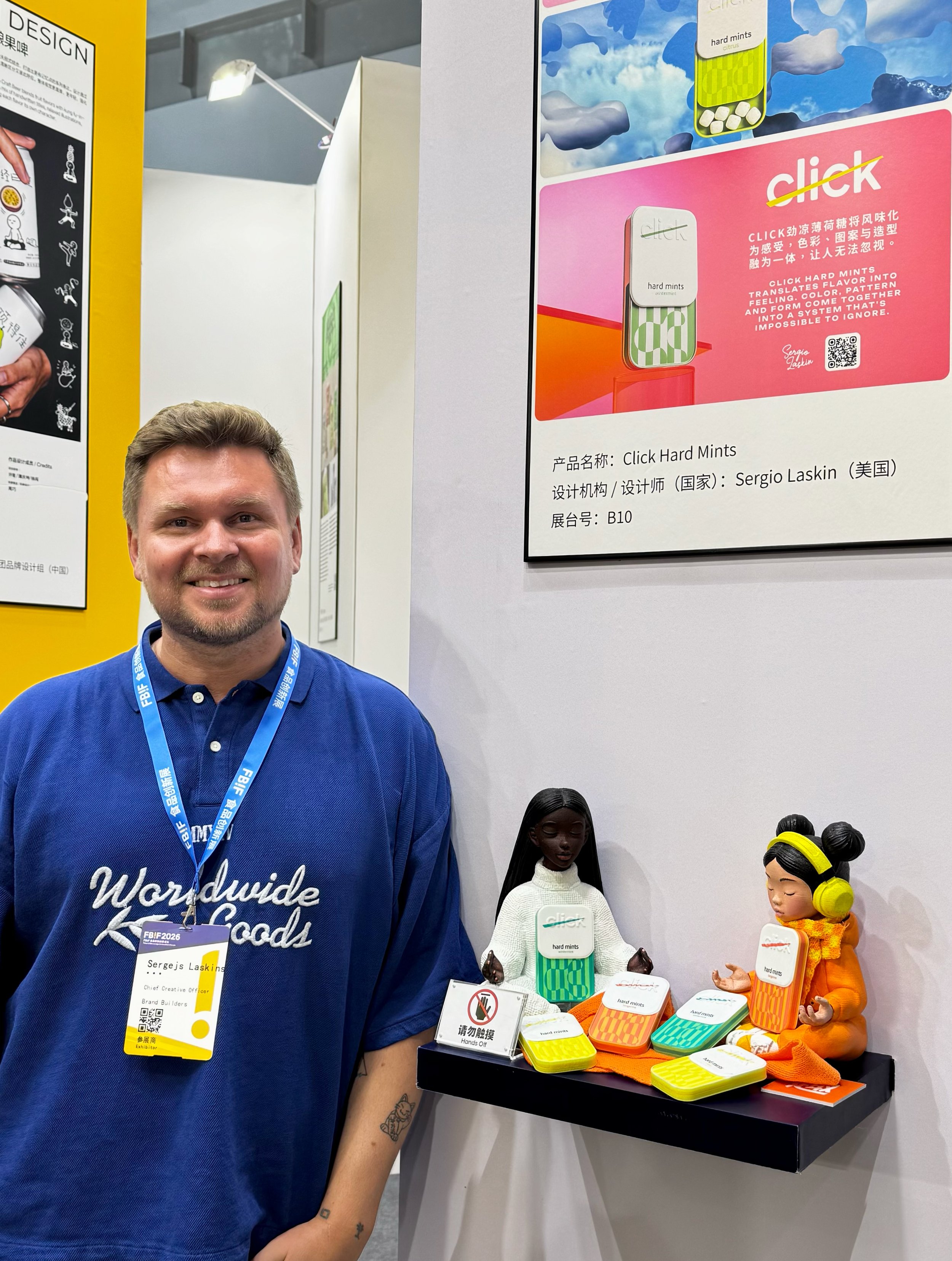
The project was also selected for Pentawards Monthly Discoveries, published by Inspiration Grid and exhibited at FBIF 2026 in China alongside Coastal Buns.
Its recognition across design platforms and a physical packaging exhibition reinforced the original idea behind the project: even the smallest everyday product can become memorable when every element is built around one clear gesture.


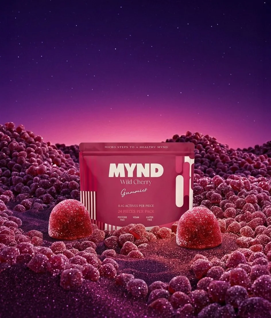
What if mushroom supplements became a retro space odyssey?