
HARAX Olive Oil Branding,
Packaging & Creative Direction
From the Peloponnese with character
Brand Identity · Packaging Design · Illustration · Website Design · Art DirectionClient location: Canada · Product origin: Greece
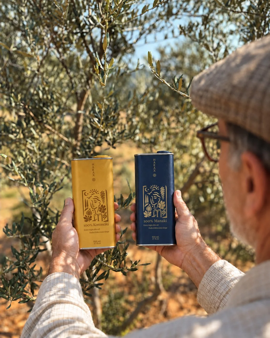
For HARAX, I developed a brand identity and packaging system that brings Greek olive oil into a contemporary Mediterranean world. The work connects three olive varieties (Manaki, Koroneiki and Koutsourelia) through one recognisable visual language.
The idea starts at the everyday table: good bread, a generous pour and a meal shared with others. From the wordmark and illustration to the tin packaging and website, each touchpoint carries that same warmth and sense of origin.
Greek origin. Mediterranean spirit.
Behind HARAX is a story of place, craft and family. We wanted the illustration to capture the creativity involved in harvesting olives and making oil - and the personal connection that gives it meaning.
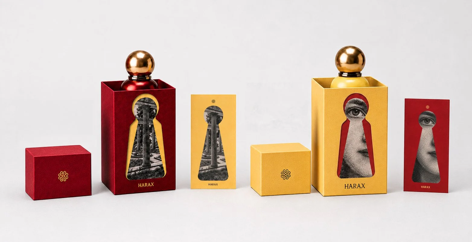
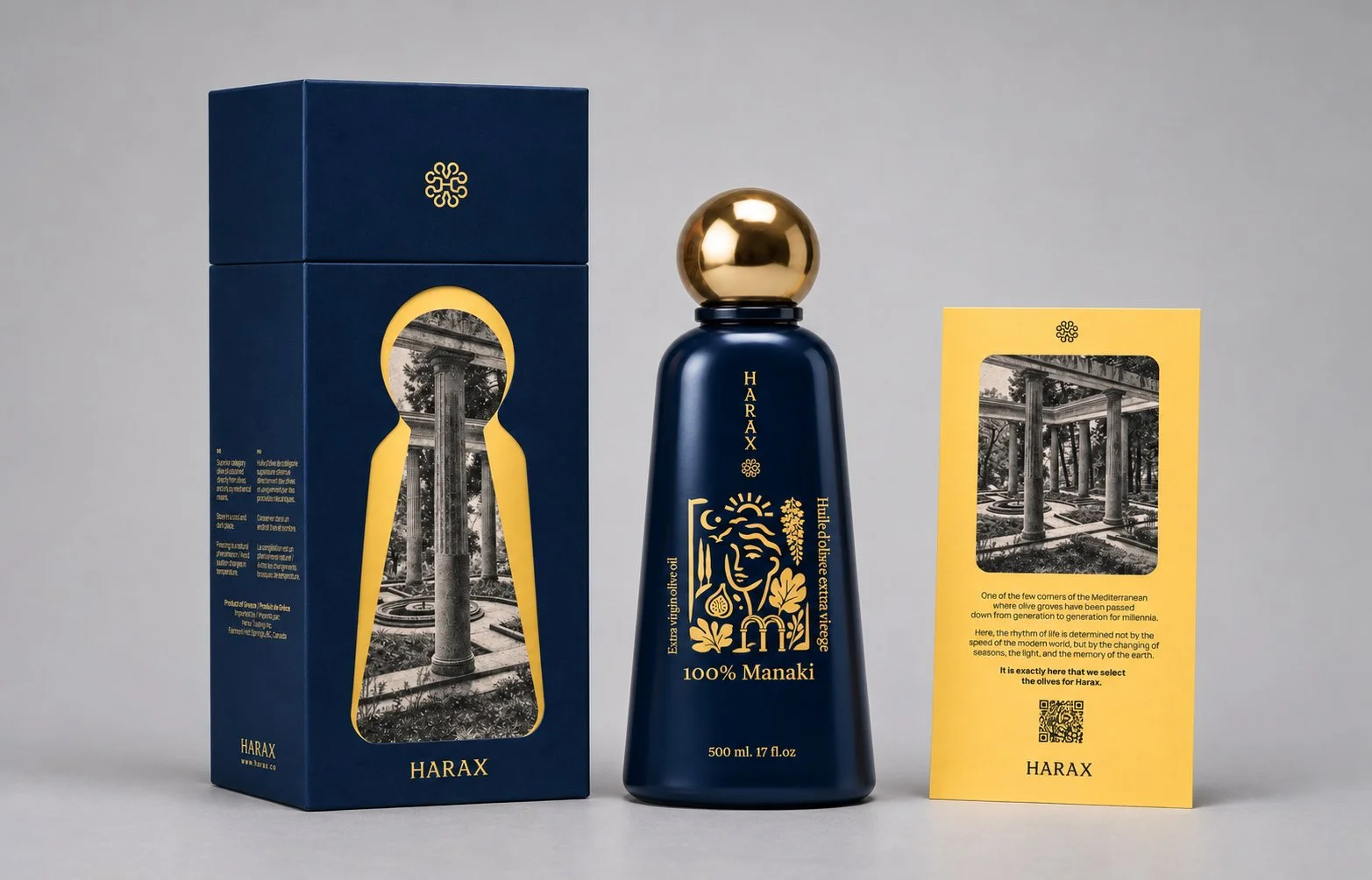
Woven into the artwork are symbols of the region and the face of the founder’s daughter. Together, they turn the illustration into a personal tribute, carrying a family story across the packaging and gift materials, ready to be shared and kept.
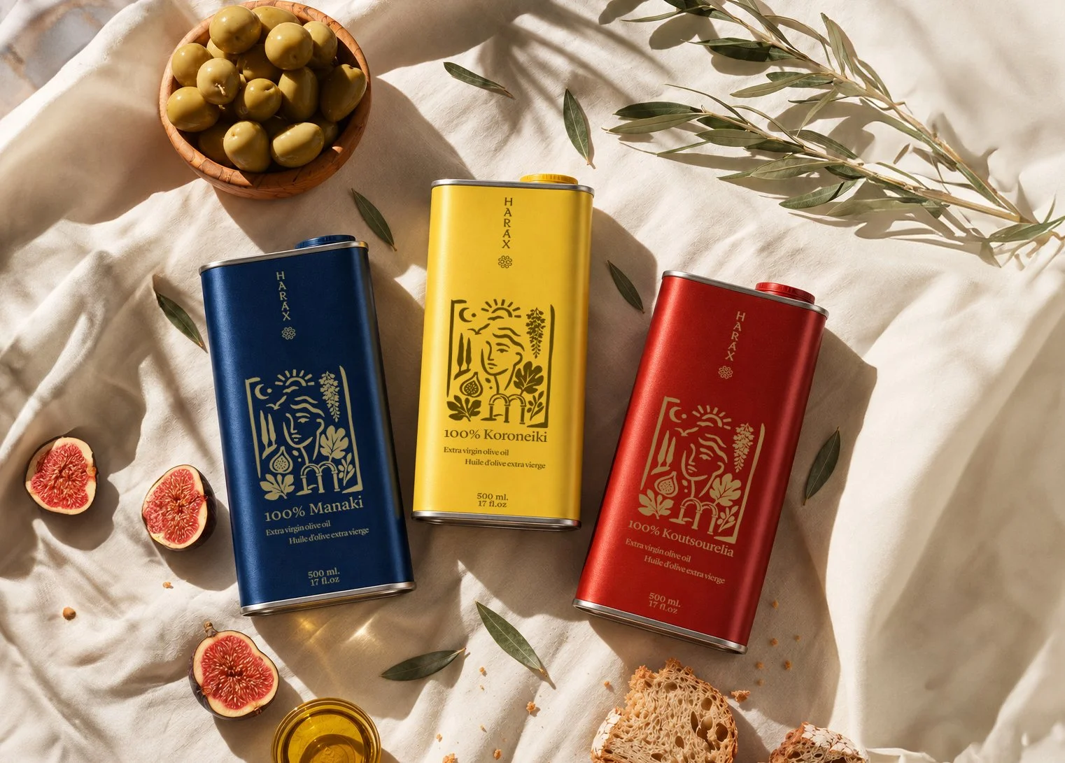
Three varieties. One family.
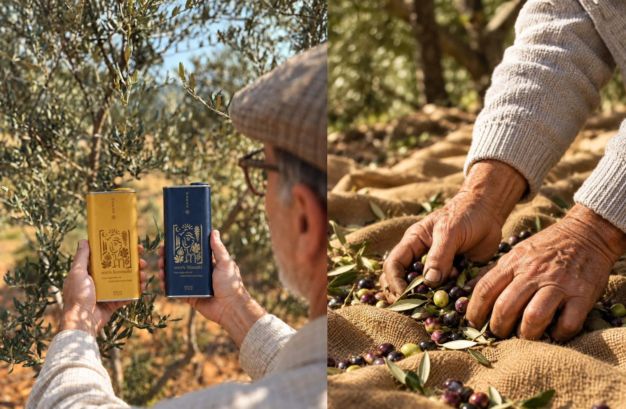
Manaki in deep blue, Koroneiki in golden yellow and Koutsourelia in rich red. Each olive variety brings its own flavour and story, expressed through a colour that invites a personal choice - for the food you’re sharing, the table you’re setting or simply the mood of the day.
The collection comes in two expressions: retail packaging for everyday rituals and a gift edition made for giving. Both carry the same family story, whether you’re bringing HARAX to your own table or someone else’s.
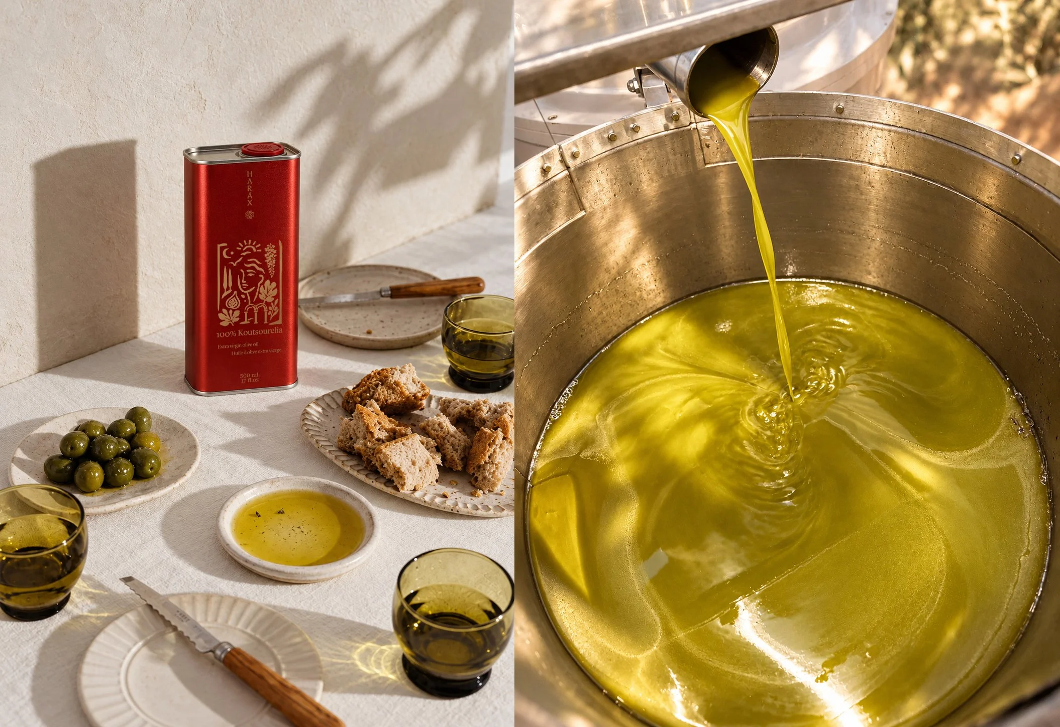
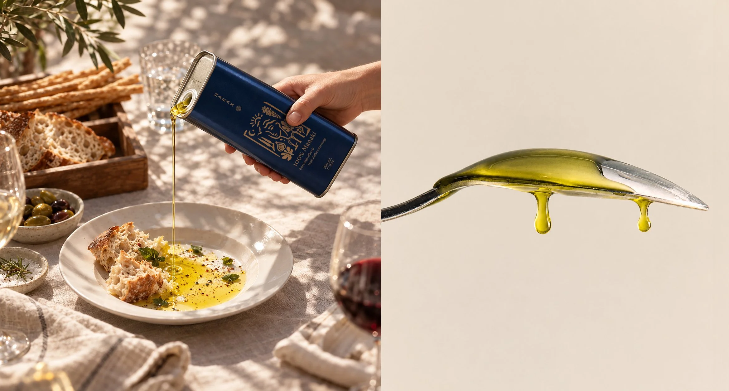
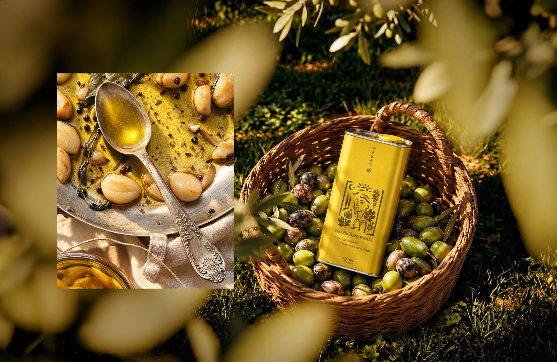
A little ritual. A richer everyday.
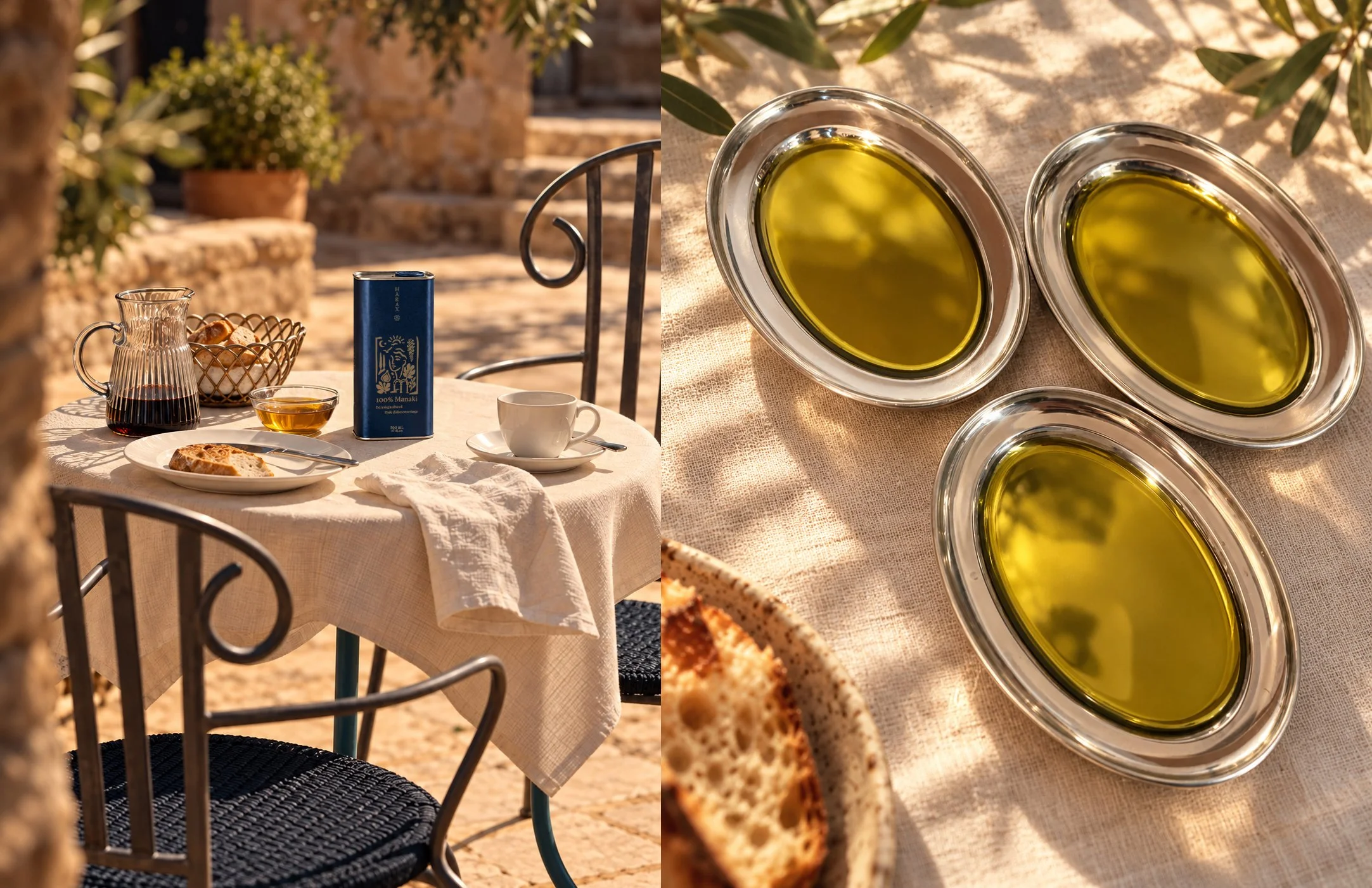
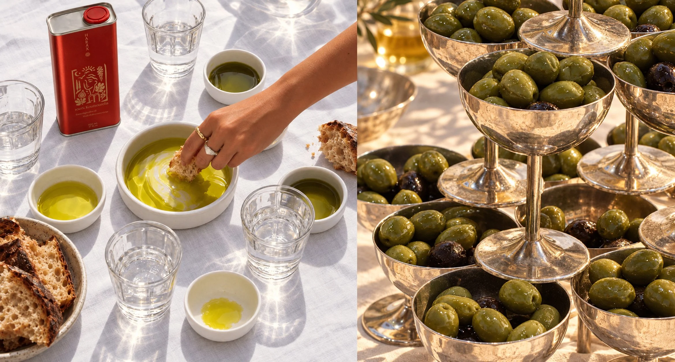
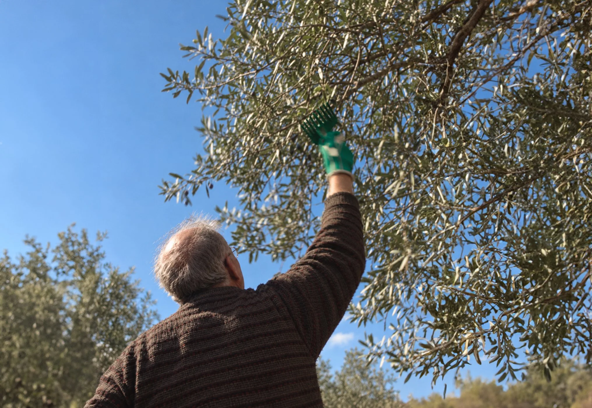
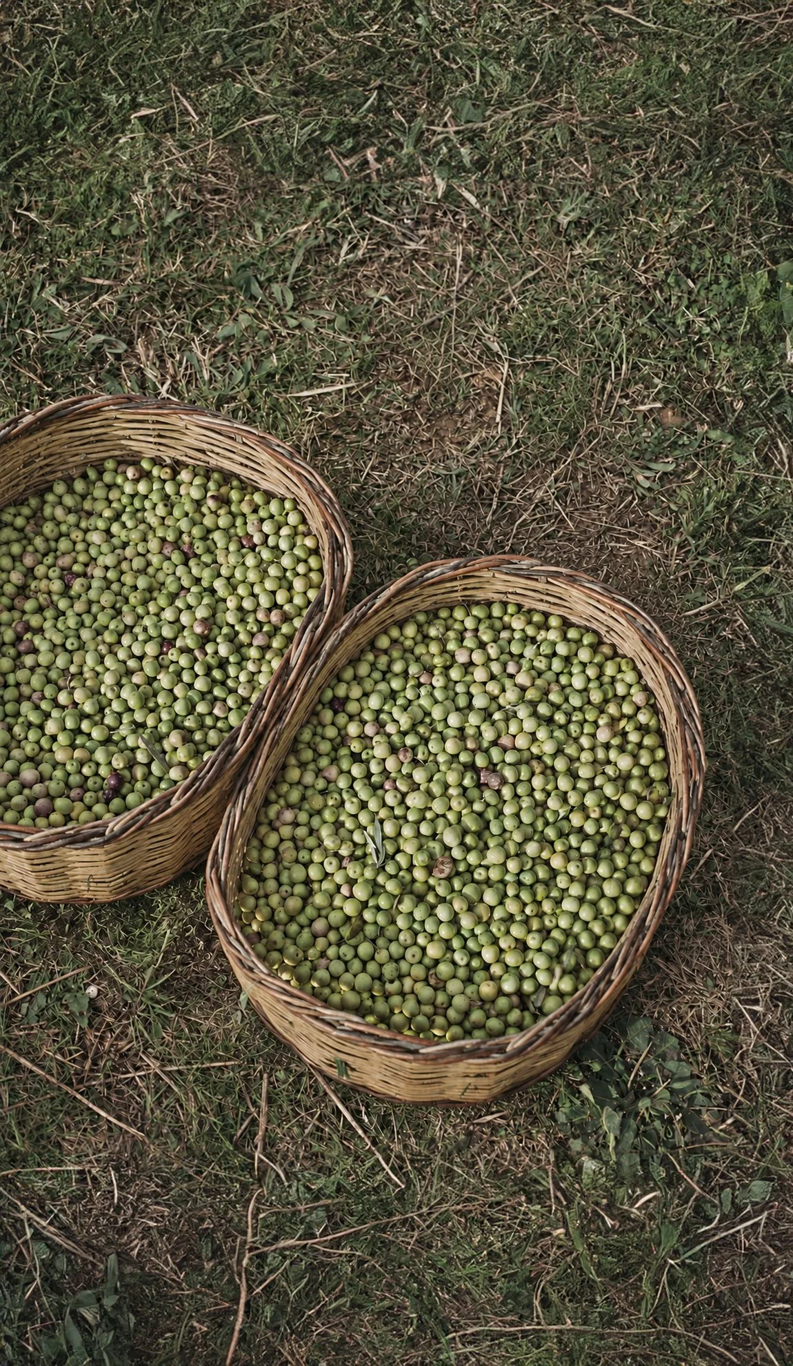
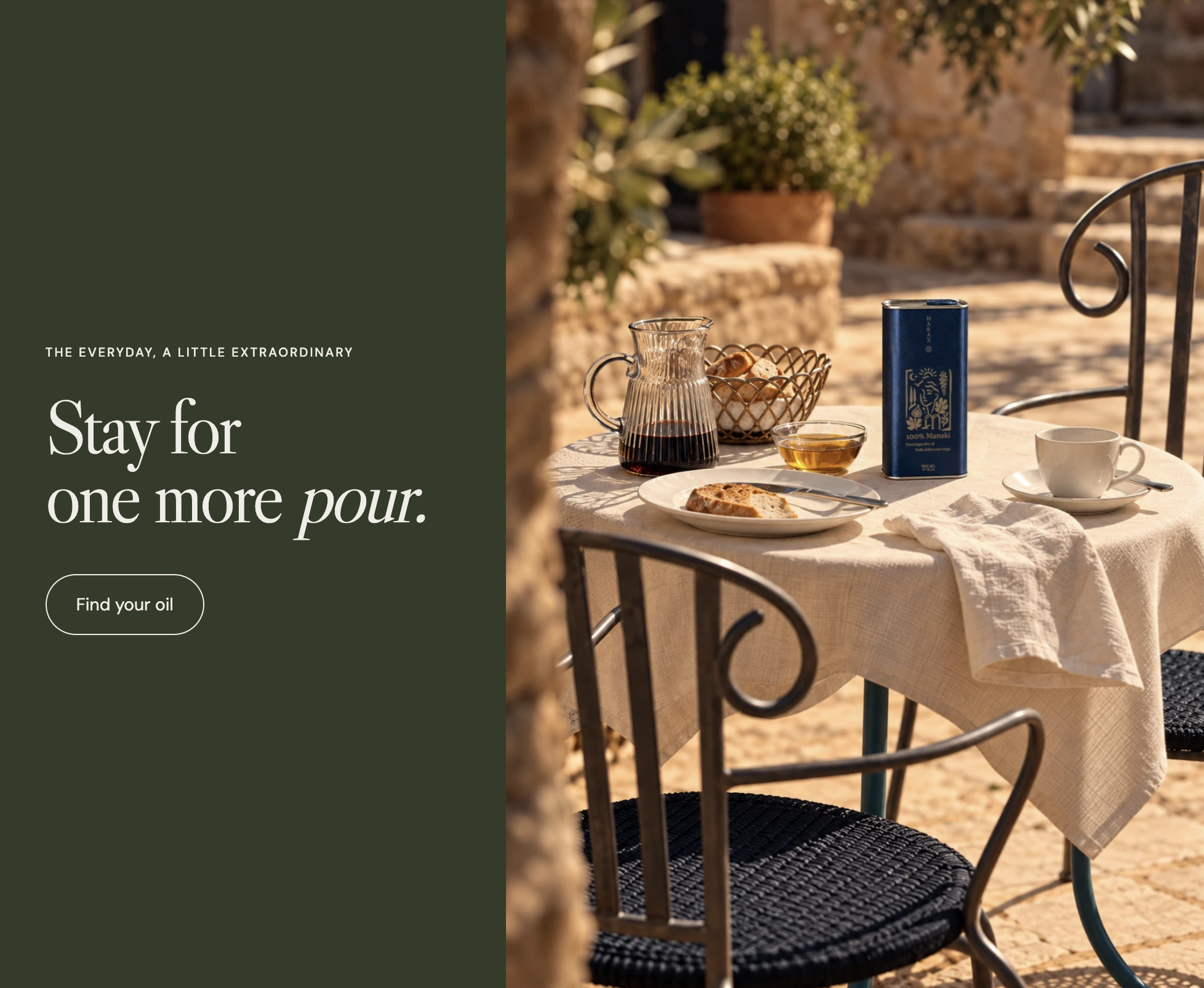
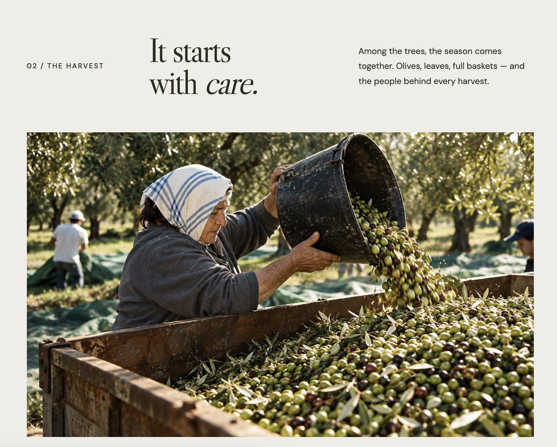
The imagery places the packaging in the moments it was designed for: a piece of bread dipped in oil, a table in the sun, the texture of linen and the olive harvest. Natural gestures and close details connect the product with the everyday pleasure of using it.
Clean product compositions make the illustration and colour system legible. Warmer scenes bring the collection into a lived-in Mediterranean setting.
The same identity, online
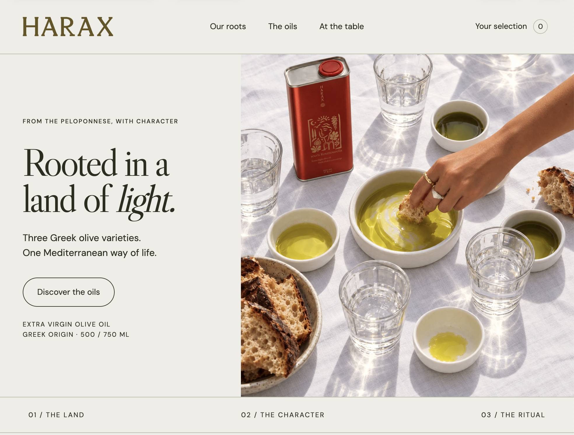
The website design translates the packaging into an editorial experience: warm paper tones, olive accents, expressive headlines and large product imagery. The three varieties share a clear structure, with room for their individual colours and formats.
The brandbook brings these decisions together, giving the identity a consistent foundation across packaging, digital layouts and future communication.
From concept to the first production run